Web Analytics Made Easy - Statcounter

Case Study: RevoU DAMC Certification (July 22)

Fictional Project
R
See how I tackle RevoU DAMC’s Certification Case Study using R
Author

invictus

Published

July 24, 2024

Introduction

Recently, I enrolled in a Mini-Course Data Analytics course from RevoU. It’s a basic overview and introduction to the world of Data Analytics. At the end of it, you’ll get a case study you can work on. That case study is the one I’ll be working on today.

Actually, I’ve done a pretty rough analysis and visualization with it, but it was all over the place. So, I want to redo it from scratch, hopefully in a more structured format.

About the case study

Description

The case study contains a dataset about sales data of a fictional company. The columns are described as follows:

ORDERNUMBER: A unique identifier for each sales order.

QUANTITYORDERED: The number of units ordered for a particular product.

PRICEEACH: The price of a single unit of the product.

ORDERDATE: The date when the order was placed.

STATUS: The current status of the order (e.g., Shipped, Cancelled, On Hold).

PRODUCTLINE: The category or line to which the product belongs.

PRODUCTCODE: A unique code identifying the product.

CUSTOMERNAME: The name of the customer who placed the order.

CITY: The city where the customer is located.

DEALSIZE: The size category of the deal (e.g., Small, Medium, Large)

Task

The task is to find answers to the following questions:

  1. Which product lines have the highest and lowest sales? Create a chart that is representable.
  2. Show sales performance over time, is there any pattern?
  3. How does deal size (small, medium, large) correlate with total sales? What is the percentage of contribution for each type of deal?

Get Started

Inspect and Clean Data

Without further ado, let’s load the tidyverse!

library(tidyverse)
── Attaching core tidyverse packages ──────────────────────── tidyverse 2.0.0 ──
✔ dplyr     1.1.4     ✔ readr     2.1.5
✔ forcats   1.0.0     ✔ stringr   1.5.1
✔ ggplot2   3.5.1     ✔ tibble    3.2.1
✔ lubridate 1.9.3     ✔ tidyr     1.3.1
✔ purrr     1.0.2     
── Conflicts ────────────────────────────────────────── tidyverse_conflicts() ──
✖ dplyr::filter() masks stats::filter()
✖ dplyr::lag()    masks stats::lag()
ℹ Use the conflicted package (<http://conflicted.r-lib.org/>) to force all conflicts to become errors

Just to be safe, let’s take look at the first few lines of the csv.

read_lines('./revou_damc_case_study.csv', n_max = 5)
[1] "ORDERNUMBER,QUANTITYORDERED,PRICEEACH,ORDERDATE,STATUS,PRODUCTLINE,PRODUCTCODE,CUSTOMERNAME,CITY,DEALSIZE"
[2] "10100,30,100,1/6/2003 0:00,Shipped,Vintage Cars,S18_1749,Online Diecast Creations Co.,Nashua,Medium"      
[3] "10100,50,67.8,1/6/2003 0:00,Shipped,Vintage Cars,S18_2248,Online Diecast Creations Co.,Nashua,Medium"     
[4] "10100,22,86.51,1/6/2003 0:00,Shipped,Vintage Cars,S18_4409,Online Diecast Creations Co.,Nashua,Small"     
[5] "10100,49,34.47,1/6/2003 0:00,Shipped,Vintage Cars,S24_3969,Online Diecast Creations Co.,Nashua,Small"     

Looks good enough. Now let’s load the file and take a closer look

df <- read_csv('./revou_damc_case_study.csv')
Rows: 2824 Columns: 10
── Column specification ────────────────────────────────────────────────────────
Delimiter: ","
chr (7): ORDERDATE, STATUS, PRODUCTLINE, PRODUCTCODE, CUSTOMERNAME, CITY, DE...
dbl (3): ORDERNUMBER, QUANTITYORDERED, PRICEEACH

ℹ Use `spec()` to retrieve the full column specification for this data.
ℹ Specify the column types or set `show_col_types = FALSE` to quiet this message.
df |> str()
spc_tbl_ [2,824 × 10] (S3: spec_tbl_df/tbl_df/tbl/data.frame)
 $ ORDERNUMBER    : num [1:2824] 10100 10100 10100 10100 10101 ...
 $ QUANTITYORDERED: num [1:2824] 30 50 22 49 25 26 45 46 39 41 ...
 $ PRICEEACH      : num [1:2824] 100 67.8 86.5 34.5 100 ...
 $ ORDERDATE      : chr [1:2824] "1/6/2003 0:00" "1/6/2003 0:00" "1/6/2003 0:00" "1/6/2003 0:00" ...
 $ STATUS         : chr [1:2824] "Shipped" "Shipped" "Shipped" "Shipped" ...
 $ PRODUCTLINE    : chr [1:2824] "Vintage Cars" "Vintage Cars" "Vintage Cars" "Vintage Cars" ...
 $ PRODUCTCODE    : chr [1:2824] "S18_1749" "S18_2248" "S18_4409" "S24_3969" ...
 $ CUSTOMERNAME   : chr [1:2824] "Online Diecast Creations Co." "Online Diecast Creations Co." "Online Diecast Creations Co." "Online Diecast Creations Co." ...
 $ CITY           : chr [1:2824] "Nashua" "Nashua" "Nashua" "Nashua" ...
 $ DEALSIZE       : chr [1:2824] "Medium" "Medium" "Small" "Small" ...
 - attr(*, "spec")=
  .. cols(
  ..   ORDERNUMBER = col_double(),
  ..   QUANTITYORDERED = col_double(),
  ..   PRICEEACH = col_double(),
  ..   ORDERDATE = col_character(),
  ..   STATUS = col_character(),
  ..   PRODUCTLINE = col_character(),
  ..   PRODUCTCODE = col_character(),
  ..   CUSTOMERNAME = col_character(),
  ..   CITY = col_character(),
  ..   DEALSIZE = col_character()
  .. )
 - attr(*, "problems")=<externalptr> 
df
# A tibble: 2,824 × 10
   ORDERNUMBER QUANTITYORDERED PRICEEACH ORDERDATE      STATUS  PRODUCTLINE 
         <dbl>           <dbl>     <dbl> <chr>          <chr>   <chr>       
 1       10100              30     100   1/6/2003 0:00  Shipped Vintage Cars
 2       10100              50      67.8 1/6/2003 0:00  Shipped Vintage Cars
 3       10100              22      86.5 1/6/2003 0:00  Shipped Vintage Cars
 4       10100              49      34.5 1/6/2003 0:00  Shipped Vintage Cars
 5       10101              25     100   1/9/2003 0:00  Shipped Vintage Cars
 6       10101              26     100   1/9/2003 0:00  Shipped Vintage Cars
 7       10101              45      31.2 1/9/2003 0:00  Shipped Vintage Cars
 8       10101              46      53.8 1/9/2003 0:00  Shipped Vintage Cars
 9       10102              39     100   1/10/2003 0:00 Shipped Vintage Cars
10       10102              41      50.1 1/10/2003 0:00 Shipped Vintage Cars
# ℹ 2,814 more rows
# ℹ 4 more variables: PRODUCTCODE <chr>, CUSTOMERNAME <chr>, CITY <chr>,
#   DEALSIZE <chr>

Clean Date

The first glaring issue is the date. It’s still in <chr>. However, the first few rows have all the same hms (hours, minutes, seconds). So, there’s a possibility it’s the same all the way down. Let’s see…

df |> 
  separate_wider_delim(ORDERDATE, delim = ' ', names = c('ORDERDATE', 'ORDERHOUR')) |> 
  count(ORDERHOUR)
# A tibble: 1 × 2
  ORDERHOUR     n
  <chr>     <int>
1 0:00       2824

I knew it. It’s very unlikely for all orders to be exactly on the same hours. So, the most probable thing is they don’t have data on the hms, so they just insert 0:00 as a placeholder. Since the placeholder is not useful for us, let’s drop it.

df <- df |> 
  separate_wider_delim(ORDERDATE, delim = ' ', names = c('ORDERDATE', 'ORDERHOUR')) |> 
  select(!ORDERHOUR)

Let’s also parse the date while we’re at it.

df <- df |> 
  mutate(ORDERDATE = mdy(ORDERDATE))

ORDERDATE is likely be one of the key variables in our analysis. So, we’ll frequently work with that

Clean Price

Since we’re dealing with sales data, the next important thing is the numbers: price, quantity, revenue. Let’s take a look again at the data.

df
# A tibble: 2,824 × 10
   ORDERNUMBER QUANTITYORDERED PRICEEACH ORDERDATE  STATUS  PRODUCTLINE 
         <dbl>           <dbl>     <dbl> <date>     <chr>   <chr>       
 1       10100              30     100   2003-01-06 Shipped Vintage Cars
 2       10100              50      67.8 2003-01-06 Shipped Vintage Cars
 3       10100              22      86.5 2003-01-06 Shipped Vintage Cars
 4       10100              49      34.5 2003-01-06 Shipped Vintage Cars
 5       10101              25     100   2003-01-09 Shipped Vintage Cars
 6       10101              26     100   2003-01-09 Shipped Vintage Cars
 7       10101              45      31.2 2003-01-09 Shipped Vintage Cars
 8       10101              46      53.8 2003-01-09 Shipped Vintage Cars
 9       10102              39     100   2003-01-10 Shipped Vintage Cars
10       10102              41      50.1 2003-01-10 Shipped Vintage Cars
# ℹ 2,814 more rows
# ℹ 4 more variables: PRODUCTCODE <chr>, CUSTOMERNAME <chr>, CITY <chr>,
#   DEALSIZE <chr>

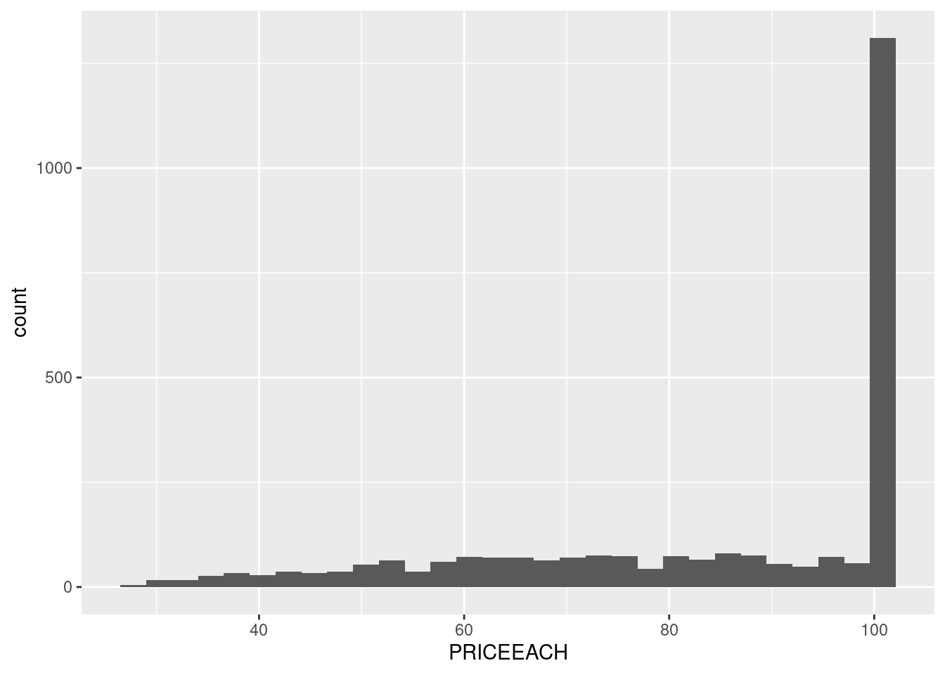
Unfortunately, the case study doesn’t provide any information on the currency. So, let’s assume it’s in USD. Now let’s see the distribution.

df |> 
  ggplot(aes(PRICEEACH)) +
  geom_histogram()
`stat_bin()` using `bins = 30`. Pick better value with `binwidth`.

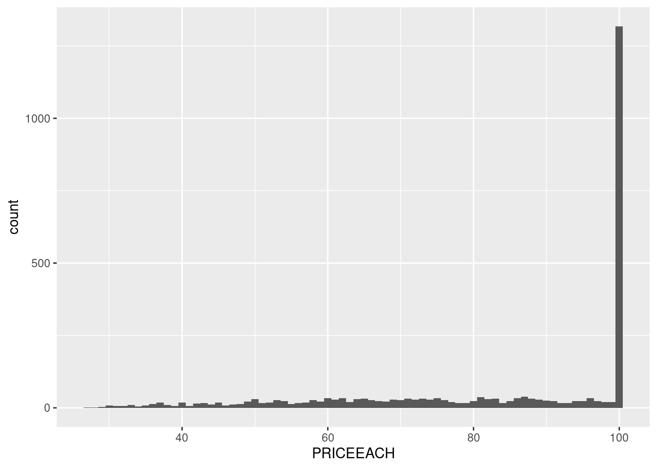
The price is indeed unusual. From the first few rows, it even seems that it’s not just about ranging around 100, but it’s exactly 100. Let’s set the binwidth to 1 to prove it.

df |> 
  ggplot(aes(PRICEEACH)) +
  geom_histogram(binwidth = 1)

Yup, exactly. Let’s see it from the table for clearer numbers using count()

df |> 
  count(PRICEEACH, sort = TRUE)
# A tibble: 1,016 × 2
   PRICEEACH     n
       <dbl> <int>
 1     100    1304
 2      59.9     6
 3      96.3     6
 4      51.9     5
 5      57.7     5
 6      62.0     5
 7      67.1     5
 8      80.6     5
 9      89.4     5
10      90.2     5
# ℹ 1,006 more rows

Yeah… I’ll be honest, I have no idea why this could’ve happened, unless the data is fake. (Oh wait, it is!). But in a real world, we can’t do that assumption. We have to be prepared for any unexpected data. So, let’s treat this dataset as a real one even though we know it’s not.

Okay, so the data is sales data, precisely orders data. So, what we got previously is the distribution of the sales, not the price of the product themselves. So, one explanation of it happened is because the products that are most sought of are the one that has the price of $100.

Nevertheless, how many products are there that are priced at $100? 1? 2? if there’s many products priced at $100, then we can assume there’s nothing special with the products. They’re just the most common.

Let’s see…

df |> 
  distinct(PRODUCTCODE, PRICEEACH) |> 
  ggplot(aes(PRICEEACH)) +
  geom_histogram(binwidth = 1)

Now the data is getting weirder. Why would a store prices most of the products at $100?

Again, I have no idea. So, if you know something, let me know in the comments. s

Clean QuantityOrdered

The next important variable is QUANTITYORDERED. Let’s see if it also has similar anomaly

df |> 
  ggplot(aes(QUANTITYORDERED)) +
  geom_histogram(binwidth = 1)

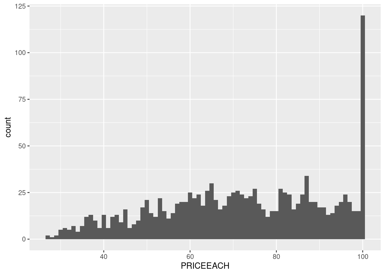
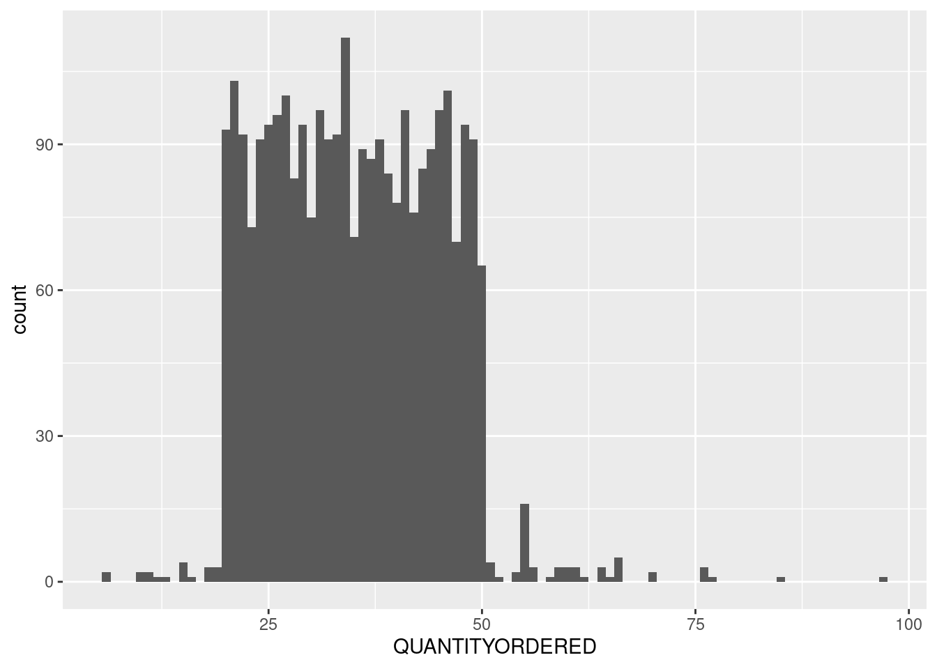
Finally, a normal data! just kidding 😂. Anyway, the distribution looks acceptable. Few outliers there and there, most values are around the median, etc. I’m not familiar with business, but I’m quite certain it doesn’t have the same anomaly as the PRICEEACH.

Analyze and Visualize

The important variables has been checked. Now it’s time to solve the questions.

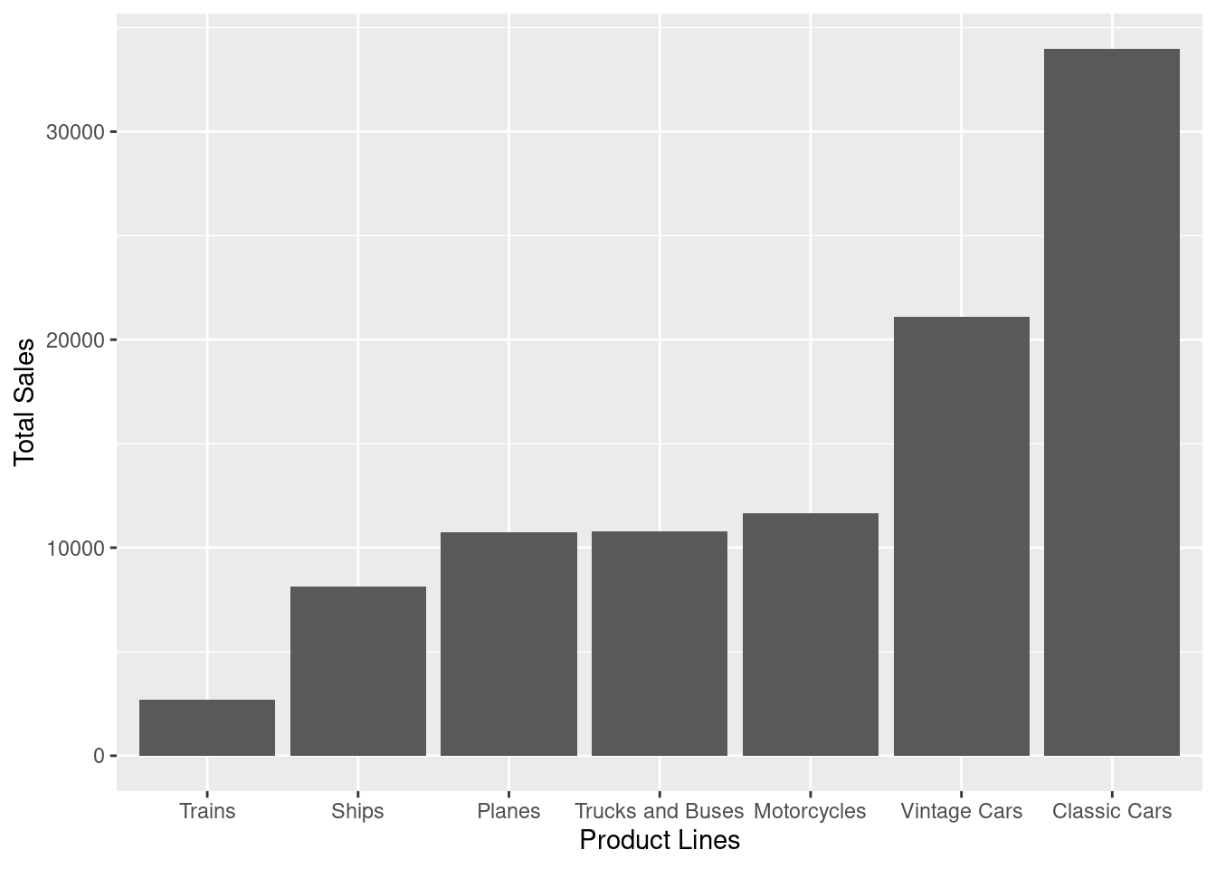
1. Product Lines Sales

  1. Which product lines have the highest and lowest sales? Create a chart that is representable.

Oh, right. Forgot to check the categorical variables. Welp, let’s just deal with it as we go. Anyway, I assume ‘sales’ here mean the quantity of units sold. We can compute that from aggregating the PRODUCTLINE with their QUANITITYORDERED.

df |> count(PRODUCTLINE, wt = QUANTITYORDERED, sort = TRUE)
# A tibble: 7 × 2
  PRODUCTLINE          n
  <chr>            <dbl>
1 Classic Cars     33992
2 Vintage Cars     21097
3 Motorcycles      11663
4 Trucks and Buses 10777
5 Planes           10727
6 Ships             8127
7 Trains            2712

Ohh, this is why I love count(). Anyway, the task is to create a chart. So let’s fire up ggplot.

df |> 
  count(PRODUCTLINE, wt = QUANTITYORDERED) |> 
  ggplot(aes(fct_reorder(PRODUCTLINE, n), n)) +
  geom_col() +
  labs(x='Product Lines', y='Total Sales')

From this, we can see that the lowest sales are from Trains, and the highest is from Classic Cars.

2. Sales Performance Pattern

  1. Show sales performance over time, is there any pattern?

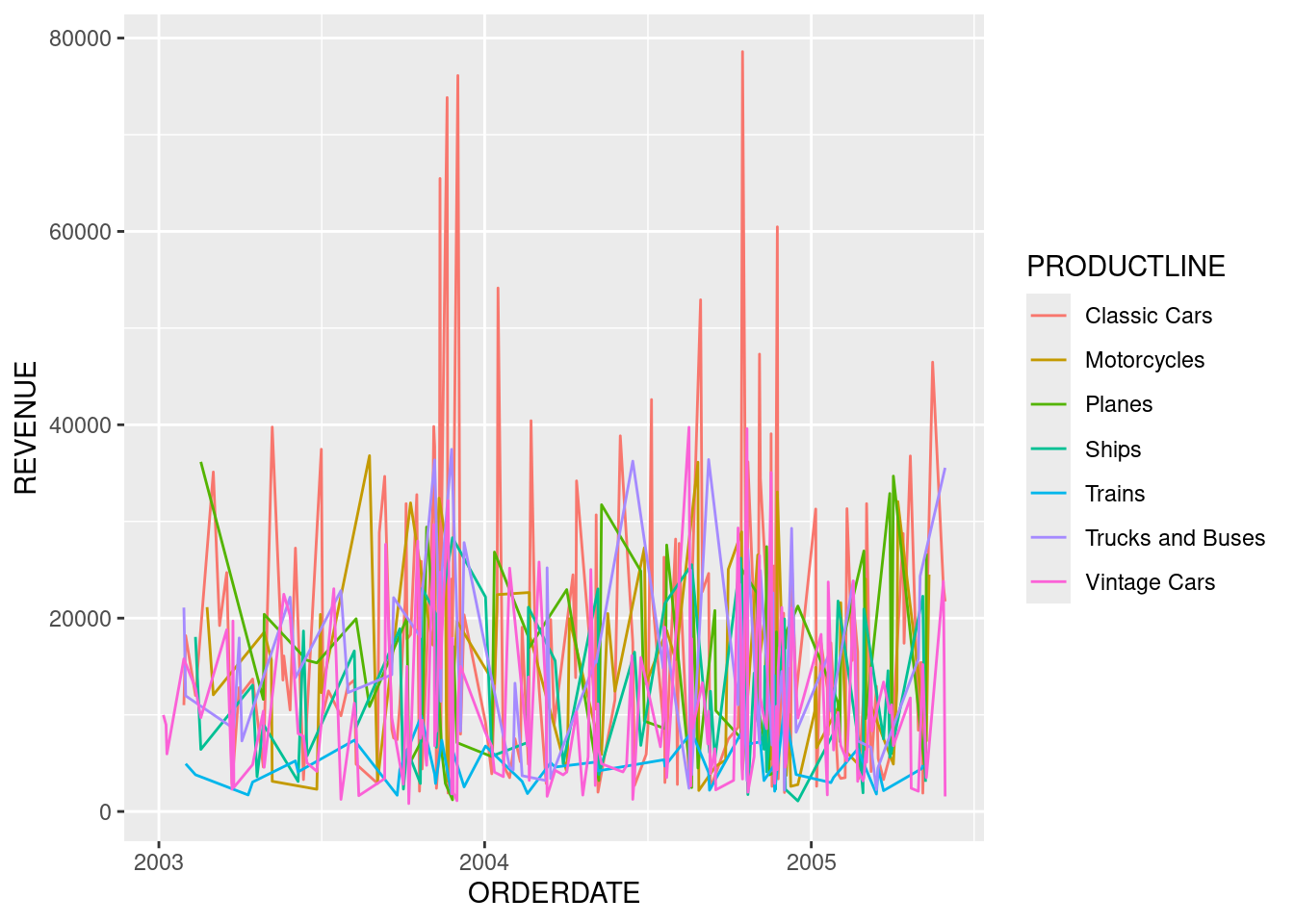
Again, we need to understand what does Sales Perfomance mean? It can be measured from various metrics, depending on the goals, so we need to guess. Since it’s just a simple case study, let’s go with revenue, which can be obtained from multiplying QUANTITYORDERED and PRICEEACH

First, let’s create a new revenue column

df <- df |> 
  mutate(revenue = QUANTITYORDERED * PRICEEACH, .after = PRICEEACH)

df
# A tibble: 2,824 × 11
   ORDERNUMBER QUANTITYORDERED PRICEEACH revenue ORDERDATE  STATUS  PRODUCTLINE 
         <dbl>           <dbl>     <dbl>   <dbl> <date>     <chr>   <chr>       
 1       10100              30     100     3000  2003-01-06 Shipped Vintage Cars
 2       10100              50      67.8   3390  2003-01-06 Shipped Vintage Cars
 3       10100              22      86.5   1903. 2003-01-06 Shipped Vintage Cars
 4       10100              49      34.5   1689. 2003-01-06 Shipped Vintage Cars
 5       10101              25     100     2500  2003-01-09 Shipped Vintage Cars
 6       10101              26     100     2600  2003-01-09 Shipped Vintage Cars
 7       10101              45      31.2   1404  2003-01-09 Shipped Vintage Cars
 8       10101              46      53.8   2473. 2003-01-09 Shipped Vintage Cars
 9       10102              39     100     3900  2003-01-10 Shipped Vintage Cars
10       10102              41      50.1   2056. 2003-01-10 Shipped Vintage Cars
# ℹ 2,814 more rows
# ℹ 4 more variables: PRODUCTCODE <chr>, CUSTOMERNAME <chr>, CITY <chr>,
#   DEALSIZE <chr>
By Product Lines

Now, we can compute the total revenue of each PRODUCTLINE per day using count()

daily_revenue <- df |> 
  count(ORDERDATE, PRODUCTLINE, wt = revenue, name = 'REVENUE')

daily_revenue
# A tibble: 600 × 3
   ORDERDATE  PRODUCTLINE      REVENUE
   <date>     <chr>              <dbl>
 1 2003-01-06 Vintage Cars       9982.
 2 2003-01-09 Vintage Cars       8977.
 3 2003-01-10 Vintage Cars       5956.
 4 2003-01-29 Classic Cars      11000 
 5 2003-01-29 Trucks and Buses  21093.
 6 2003-01-29 Vintage Cars      15793.
 7 2003-01-31 Classic Cars      18185.
 8 2003-01-31 Trains             4934.
 9 2003-01-31 Trucks and Buses  11967.
10 2003-02-11 Classic Cars      12000 
# ℹ 590 more rows
daily_revenue |> 
  ggplot(aes(ORDERDATE, REVENUE, color=PRODUCTLINE)) +
  geom_line()

Wow, there’s too much lines on the same place. Let’s divide them up with facet.

daily_revenue |> 
  ggplot(aes(ORDERDATE, REVENUE, color=PRODUCTLINE)) +
  geom_line() +
  facet_wrap(. ~ PRODUCTLINE, ncol = 1)

It looks better now, still feel too much. The Y axis is barely readeable. Maybe we need to display fewer PRODUCTLINE at a time.

All Sales

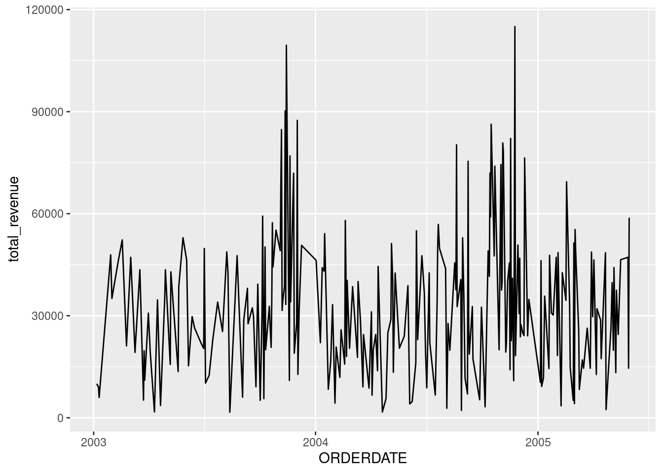
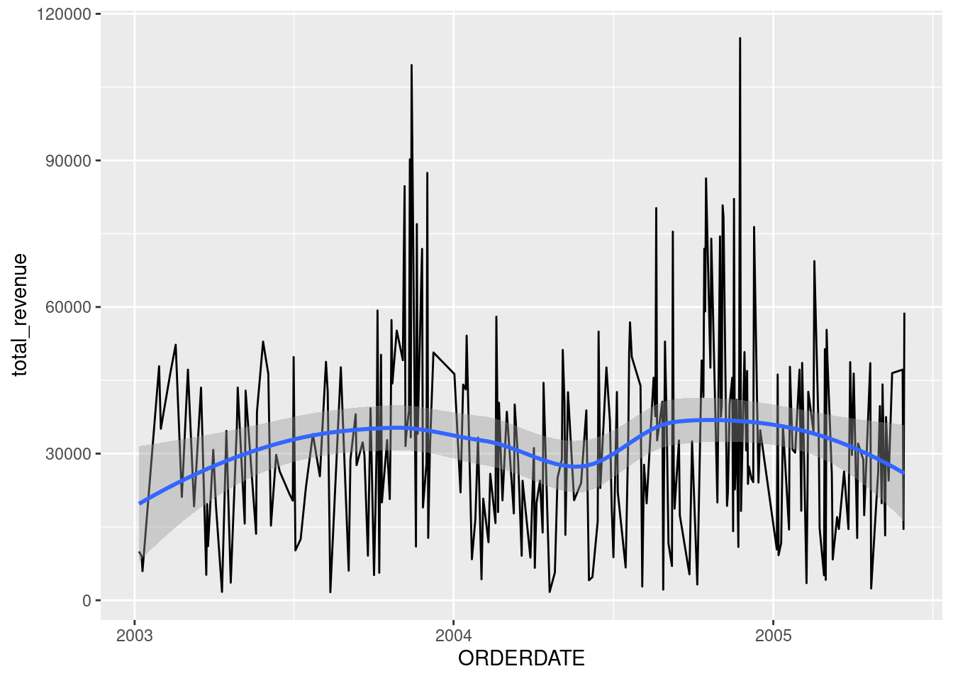
Actually, I just realized that it wasn’t asked to group by PRODUCTLINE. So, we could’ve just plot the entire sales. For this, we need to re-aggregate the daily_revenue to get a summarized revenue across all PRODUCTLINE.

daily_revenue_total <- daily_revenue |> 
  count(ORDERDATE, wt = REVENUE, name = 'total_revenue')
daily_revenue_total |> 
  ggplot(aes(ORDERDATE, total_revenue)) +
  geom_line() 

We can roughly see the peaks in the later parts of the year. We can add a geom_smooth() to help visualize the pattern.

daily_revenue_total |> 
  ggplot(aes(ORDERDATE, total_revenue)) +
  geom_line() +
  geom_smooth()
`geom_smooth()` using method = 'loess' and formula = 'y ~ x'

Maybe we can see the pattern better if we divide the plot by year

daily_revenue_total <- daily_revenue_total |> 
  mutate(year = year(ORDERDATE) |> as_factor())
daily_revenue_total |> 
  ggplot(aes(ORDERDATE, total_revenue)) +
  geom_line() +
  facet_wrap(. ~ year, scales = 'free_x', ncol = 1) +
  scale_x_date(date_labels = '%b',date_breaks = '1 month')

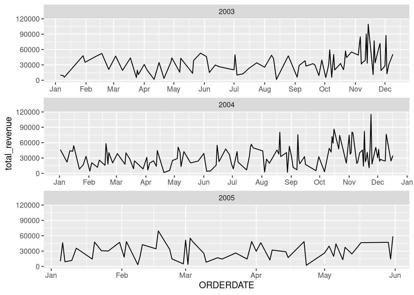
Now we got a clearer broad overview of the trend by year. However, the small size of the plot make it a little bit hard to identify the pattern. Let’s zoom in by drawing each plot for each year.
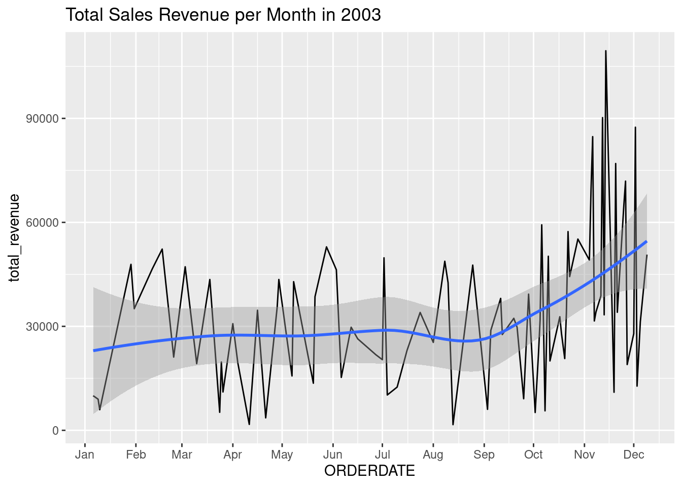
daily_revenue_total |> 
  filter(year(ORDERDATE) == 2003) |> 
  ggplot(aes(ORDERDATE, total_revenue)) +
  geom_line() + 
  geom_smooth() +
  scale_x_date(date_labels = '%b',date_breaks = '1 month') +
  labs(title = 'Total Sales Revenue per Month in 2003')
`geom_smooth()` using method = 'loess' and formula = 'y ~ x'

Now we can clearly see the peak on around November - December. Besides, the sales seem to be already going upward starting from September

daily_revenue_total |> 
  filter(year(ORDERDATE) == 2004) |> 
  ggplot(aes(ORDERDATE, total_revenue)) +
  geom_line() + 
  geom_smooth() +
  scale_x_date(date_labels = '%b',date_breaks = '1 month') +
  labs(title = 'Total Sales Revenue per Month in 2004')
`geom_smooth()` using method = 'loess' and formula = 'y ~ x'

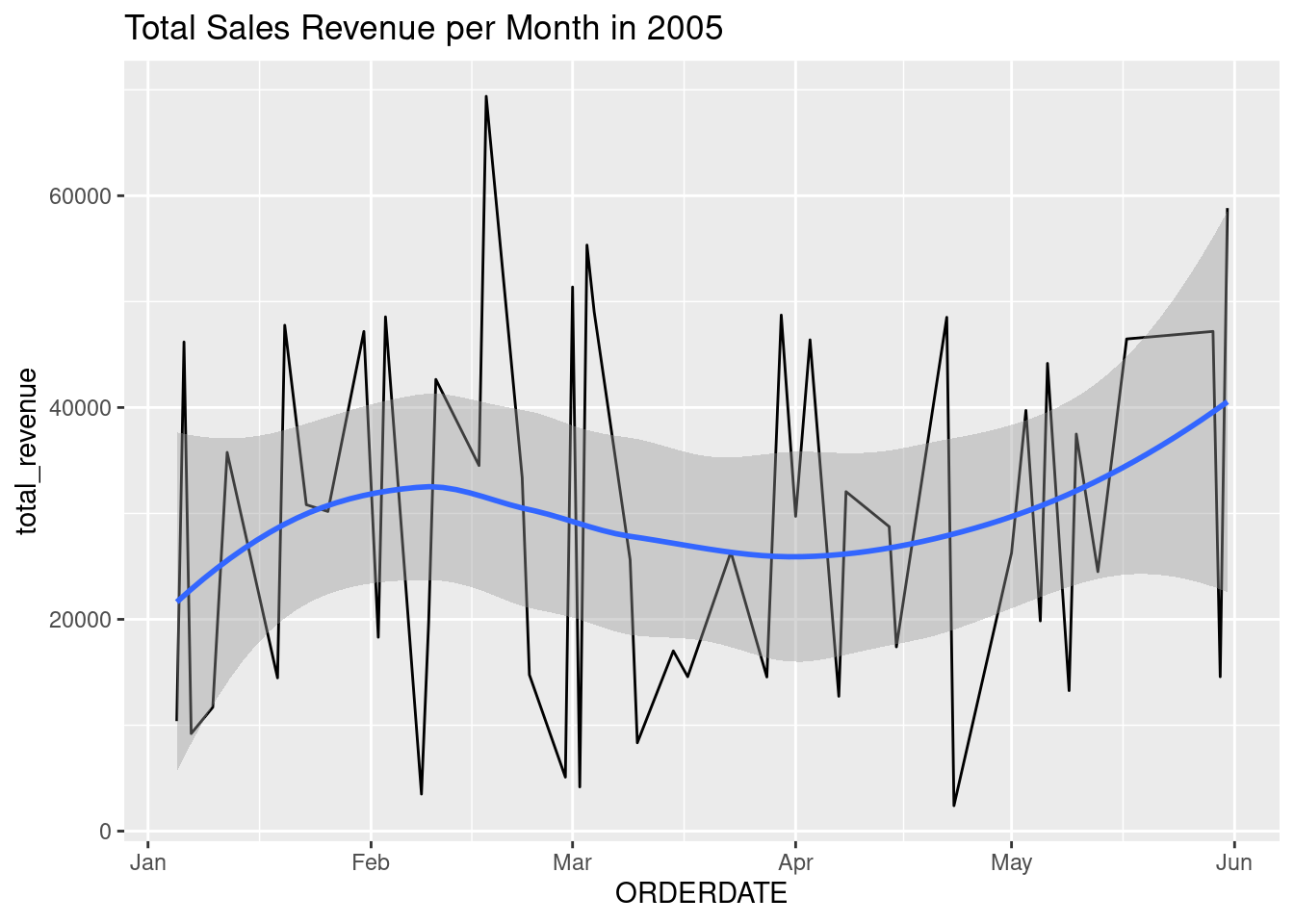
In 2005, the pattern a bit fluctuates. Yet, there’s still a generate upward trend toward the last months of the year. Moreover, the peaks are the same, which are around November - December

daily_revenue_total |> 
  filter(year(ORDERDATE) == 2005) |> 
  ggplot(aes(ORDERDATE, total_revenue)) +
  geom_line() + 
  geom_smooth() +
  scale_x_date(date_labels = '%b',date_breaks = '1 month') +
  labs(title = 'Total Sales Revenue per Month in 2005')
`geom_smooth()` using method = 'loess' and formula = 'y ~ x'

Unfortunately, in 2005, we’re lacking data toward the later months. So we can’t see the peaks on the same months.

However, based on the pattern of the previous 2 years, we can predict that sales will also increase upward toward the last part of the years, and peak around November - December

Back to top